From Numbers to Narrative: Designing Colorful, Analytical Diagrams in the Browser
The difference between a chart and a table is not decoration, it is structure. The right visual form puts the most important comparison front and center and lets the eye do the arithmetic. In this post we build three diagrams from three different kinds of data, and for each one we interpret the picture rather than just admire it.
Every diagram here was authored as a short text script, rendered to a canvas, and exported as a high-resolution image, with no data leaving the browser. The figures are illustrative and rounded for clarity, but the patterns they reveal are real ones worth understanding.
Example 1: When one number hides three stories
Subscription businesses love a single headline figure. The streaming category crossed roughly 1.8 billion paid subscriptions, and it is tempting to stop there. The dashboard below refuses to, because subscribers, market share, and revenue each tell a different story, and only together do they describe the market.

Read it left to right. The bar chart ranks platforms by subscribers, and the gap between the leader and the field is the headline: the top service carries more subscribers than the next two combined. The donut reframes the same population as share, where the quiet protagonist is the grey slice. When the combined long tail of smaller services holds a meaningful portion of the market, it signals fragmentation: viewers are spreading across more apps, not consolidating onto fewer.
The area chart is the part most decks leave out, and it is the most revealing. Total category revenue climbs from roughly 80 billion dollars to around 190 billion across six years. That is a little over 2.3 times, or a compound rate near 15 percent per year, and the slope does not flatten. So even as subscriber growth concentrates among the leaders, the money keeps expanding, which points to price increases and advertising tiers rather than pure new-user growth.
Subscriber count, share, and revenue can move in different directions at the same time. A platform can lead on users while the category grows its dollars elsewhere. Showing all three on one canvas stops a reader from mistaking the headline for the whole picture.
Example 2: Showing the whole and the parts at once
Some questions are about proportion across many categories at the same time. A bar chart with thirty bars becomes a fence. A pie chart with thirty slices becomes confetti. A Voronoi treemap solves this by giving every category a cell whose area is proportional to its value, then packing those cells into a single shape and coloring them by group.
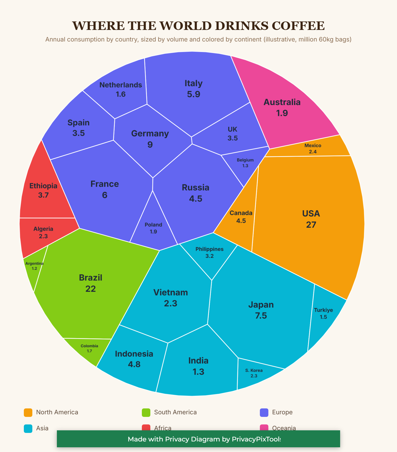
The two largest cells, the United States and Brazil, dominate the frame, and their size against everyone else lands in a way a ranked list never makes you feel. The more interesting reading is in the colored regions. Europe is not one giant cell, it is a dense cluster of medium ones: Germany, France, Italy, Spain, the United Kingdom and more. Summed by area, that indigo block rivals the single largest countries, which tells you European consumption is broad and even rather than concentrated.
Asia, in cyan, reads as a rising bloc anchored by Japan and Indonesia. And there is a quiet structural story in the small red African cells: Ethiopia appears modest here despite being one of the world's great coffee origins. That is the producer versus consumer gap, visible at a glance. The countries that grow the most are not always the ones that drink the most.
A treemap is the right tool when you need part-to-whole comparison across many items and groups at once. Color carries the category, area carries the magnitude, and the contiguous clustering lets a reader compare a region as a block and a country as a cell in the same look.
Example 3: Shape as a language
Not all data is numeric. A process is data too, and its structure is the message. The flow below traces a single online order from browse to doorstep. What makes it readable is that the shapes are not interchangeable: each one encodes a kind of thing.
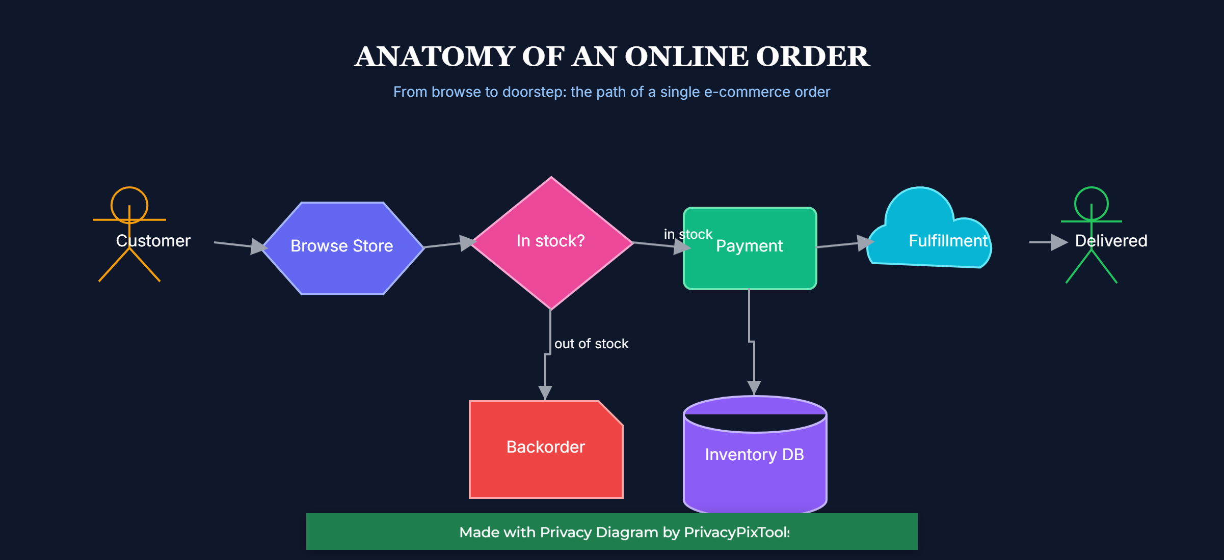
The two stick figures are people, the entry and exit of the journey. The hexagon is a system boundary, the storefront the customer touches. The pink diamond is the only decision in the diagram, and that scarcity is deliberate: a single branch is easy to follow, where a dozen would be a maze. The cylinder is unmistakably a database, the cloud is an external fulfillment service, and the red note is an exception state that sits off the main line where it belongs.
Read structurally, the diagram says something a paragraph would bury: there is exactly one place where this process forks. The happy path runs straight across to payment, fulfillment and delivery, while the out-of-stock case drops down into a backorder. When a system has only one decision point, that point is where you focus testing, monitoring and customer communication. The picture makes that obvious without a word of explanation.
In a flow, shape choice is analysis. Using a diamond only for decisions, a cylinder only for storage, and a separate shape for exceptions lets a reader parse roles instantly and spot the structural risk, which here is the single branch, before reading any label.
Example 4: When the shapes are the point
The first three examples used shape and color to carry data. Sometimes the goal is the opposite: a cover, an event poster, or a section divider where the composition itself is the message and there is no chart to read. The same primitives that drew the cells and the flow, circles, triangles, stripes, capsules and lines, compose just as well into an editorial layout.
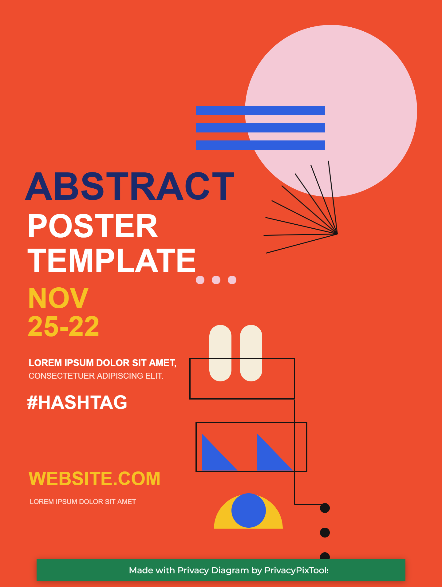
Even without data, the design follows rules you can name. A single saturated background does the heavy lifting, so every other element reads as a deliberate accent rather than noise. The type sets the hierarchy: one heavy word in a contrasting color anchors the eye, the rest steps down in size and weight. The scattered geometry is not random either. The stripes, the sunburst and the descending dots all pull toward the same corner, which gives the busy side of the poster a direction instead of a clutter.
Composition is its own kind of analysis. Color blocking, a clear type hierarchy, and a shared direction for the loose shapes turn a pile of geometry into a layout that feels intentional. The tool does not care whether a rectangle is a bar in a chart or a stripe in a poster, which means one set of primitives covers both the analytical and the expressive ends of design work.
How these were made
Each diagram above is a short text script, on the order of a few dozen lines, that describes shapes, charts, colors and connections. The script is rendered to an editable canvas in the browser and exported as a high-resolution PNG. There is no server round trip and no upload, so the underlying data stays on the machine that made it. A chart is a small block with a type, a data list, labels and colors. A treemap simply swaps the type for a Voronoi layout. A flow lists nodes with shapes and the arrows between them. The same handful of primitives produced all three very different results. The complete syntax, every shape, chart type, color and layout, is in the PSDL v3 Documentation.
If one principle connects the examples, it is this: pick the form that makes your most important comparison effortless. Ranking wants bars. Proportion across many groups wants a treemap. Sequence and decision want a flow. Choose well, use color with intent rather than for its own sake, and the diagram stops being a picture of the data and becomes an argument about it.
Back to all posts